Visual Communication Solutions

(631) 477-0277
webpro1@optimum.net

Tuesday, April 22, 2014

Preparing For Facebook Timeline Changes

Here are some great and timely pointers from Social Media Coach Andrea Vahl originally posted on her website.

You have undoubtedly heard the news that the new Facebook Timelines are rolling out to Pages sometime soon.  Facebook announced the Timeline rollout on March 10th and some Pages have it already, including Guy Kawasaki and The Nonprofit Facebook Guy (aka John Haydon).  There are 4 critical changes that you can prepare for right now.


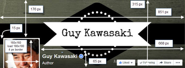
#1  Adjust Your Cover Photo

This is the biggest change that you want to prepare for right away.  The profile photo is the same size but it is now moved up farther into the cover photo image and the title of your page and category is now incorporated in the lower half of your cover photo.  Adjust any text or important images that may be under the profile photo.
You can also see the Like button and Share button is also incorporated into the bottom portion of your cover photo.  Remove any writing in the lower 65 pixels of your cover photo.  And you probably want to allow for a border above that space as well.
New Facebook cover photo dimensions 2014
You may also want to consider removing your company name if you have it in the cover photo since it will always appear there with the overlay.  Notice that The Nonprofit Facebook Guy shows just a tagline on his cover photo.

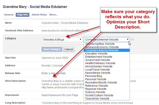
#2  Adjust Your Category

If you haven’t done so already, make sure the Category of your Page reflects what you do.  The Category is much more prominent in the new Facebook Timeline.  Go to Edit Page, then Update Page Info to check your Page category.
This is also a good time to review your Short Description and Long Description and see if those need updates as well.
Category and Short Description

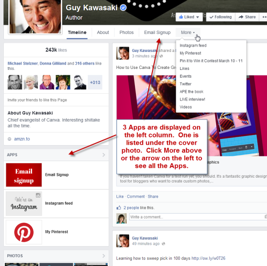
#3  Choose your 3 Best Apps that you will display

The Apps section can now be found in two places.  Once under the More button right below the cover photo and also on the left sidebar.
Your most important App should be first, in this case the Email Signup and then your next 2 best Apps should be listed next.  This is similar to the current layout where you have 3 available Apps (including the Photos) that you are showing on the first line of your Apps area.  The App cover photo sizes remain the same at 111 x 74 px.
Facebook Apps in new Timeline

#4  Adjust any graphics on your Apps

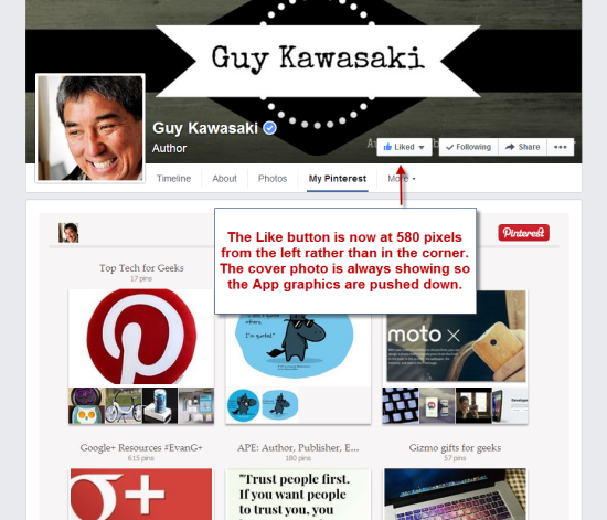
If you have an arrow on any App graphic that points  to the Like button, it is now moved from the right corner to 580 pixels from the left side.  So you may want to adjust that arrow.
You also notice that the Cover Photo is always showing so that any App you select is displaying lower than it used to.  There may not be any adjustments needed for this but something to be aware of.
Facebook App graphics

The other major change is the single column Timeline.  I think this will make the Timelines more readable again.  What are your thoughts about the new Timeline layout? Let us know.

Wednesday, April 2, 2014

40% Of Consumers Are Unaware That Google Adwords Are Adverts

This post writtern by Graham Charlton on the Econsultancy website came across our radar, we thought we should share!

Research carried out by Bunnyfoot suggests that many people are unaware of the difference between paid and organic search listings, with 40% of web users unaware they were adverts. 
While conducting a research project for an insurance sector client, Bunnyfoot discovered that 81% of users clicked on Google Adwords listings as opposed to natural search results.
Further investigation of this surprising bias revealed that 41 out of the 100 individuals tested did not know that Adwords were paid-for adverts, believing them instead to be the most authoritative links. 
Looking at a Google results page for 'car insurance', the paid ads do stand out thanks to the background shading, while Google does add the label 'ads related to car insurance' at the top. 
However, this label could be easily missed and, if you don't know they're ads, the shading could mean anything.
 
In addition, the background shading isn't always easy to see on every monitor, while Google's new hybrid sponsored ad for its own insurance comparison site looks more organic than ad. 
In short, it's easy to see why the users in the Bunnyfoot research were unaware that these ads were ads. 
Bunnyfoot's heatmaps illustrate this point. 
This shot shows the results page for 'car insurance'
https://assets.econsultancy.com/images/resized/0002/9613/adwords_heatmap2-blog-full.png
The heatmap suggests that the PPC ads may be more valuable than the top natural positions, for this search at least. 

I asked Bunnyfoot co-founder Rob Stevens about the test and the implications of the results: 

Can you tell me a bit more about the test and participants? 

The test was conducted as part of an end-to-end customer experience research project for an insurance sector client. With a view to exploring a representative of the general UK population rather than an online only population, test participants were recruited from an in-street intercept.

In theory, your findings would mean that the top two or three paid results would do better than the top organic ones...

In this particular study, we found that 81% clicked on paid results, 19% on organic search results.
In theory this may be true for some categories and the heatmap for ‘Car Insurance’ supports this hypothesis. Results of the eye tracking tests support the notion that internet users do not differentiate between organic and paid search results.
The heat map demonstrates that it’s the area of the screen displaying the top results, regardless of whether they are natural or paid for, that receives the most activity and attention from users.
In this scenario, specific terms are more likely to convert than generic ones: Marketers should optimise more specific searches for click through like “car insurance for porsche over 40” rather than “Cheap car insurance”. 

Stats we published recently suggest that the vast majority of clicks are on organic results. How does this fit with your findings? 

While a direct comparison between the two pieces of research is problematic due to a number of key differences, the two data sets are reconcilable and valuable shared learnings can be taken from both. 
The quoted GroupM research looks at a wide range of verticals from “airlines” and “online games” to “government” and “current news,” while this particular piece of research of ours looked at one very specific vertical - car insurance.  
The MEC sample is across all data while Bunnyfoot looked exclusively at the sub set of car insurance,  a category that is full of Adwords - and importantly the familiar brands abound within those Adwords - and this would have a significant bearing on results.
The specific categories undoubtedly have an effect on tests of this nature. As internet users do not follow one particular behaviour for every search they carry out, we would expect each search vertical to produce very different search patterns.
With that in mind, we would envisage the vertical “government” - one of the categories looked at in the GroupM research - generating very different behaviour from the car insurance category.
The type of search and the keywords are important considerations also. While the Bunnyfoot research looks at ‘head term’ searches, it’s unclear from the published article what the GroupM research explores. Reading the article and looking at the infographic, we would expect that the study probably includes a lot of long-tail searches.
We find that in many cases involving long tail searches (e.g. an individual searches “renew car tax”), there won’t even be any Adwords displayed and so by definition the clicks will land only on natural results in those cases.

What are the key takeaways for marketers? 

The key takeaway for marketers from this test is that there is a world of people out there who don’t know adwords are ads and marketers should be wary of making assumptions that remove them from a true consumer perspective.
We were astounded by the numbers when they first came in but there can be no doubt about it: a significant slice of internet users simply don’t recognise Adwords listings as sponsored links.
I posit that there is a digital technorati that live a lot of their life online, they (we) know that Google ads are Google ads and don’t often click them. 
I don’t know what the % is but we could apply Pareto Rule for lack of a better tool: 80% of the clicks come from 20% of the people.
Secondly - and with the above in mind - Google Ads can be a far more effective brand building tool than they are often given credit for. If the market really gets hold of this and buys into the idea that PPC on Adwords is even more effective than was previously thought this could see the cost of Google Adwords rocketing.
This makes it imperative for marketers to maximise the conversion of browsers to buyers and the most cost effective way of doing this is usability. This could put $50 or more on to the stock value of Google.

Are there easy opportunities for PPC in the kinds of results which have no or fewer PPC listings? 

Absolutely, but the user experience needs to be right before spending any money on hits. It’s all very well carrying out a PPC campaign that delivers people to a particular destination for the duration of the campaign, but it’s the user experience that converts clicks and achieves longer term success.